Healthy Meal Plans
About the Project
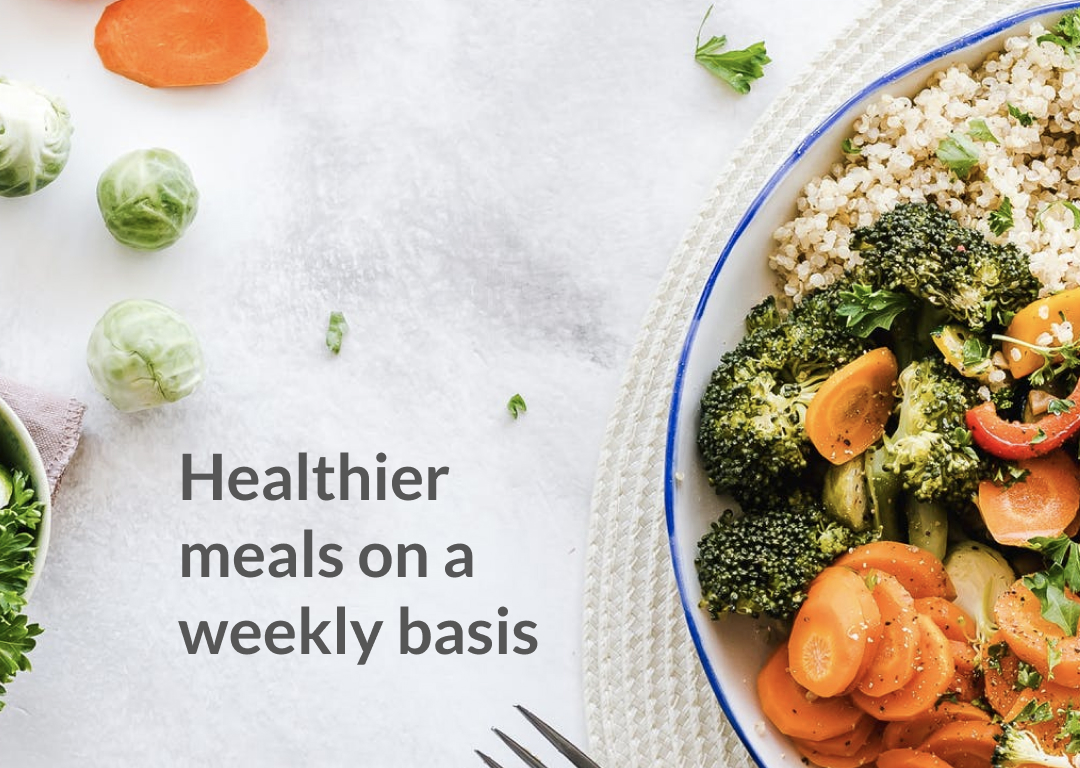
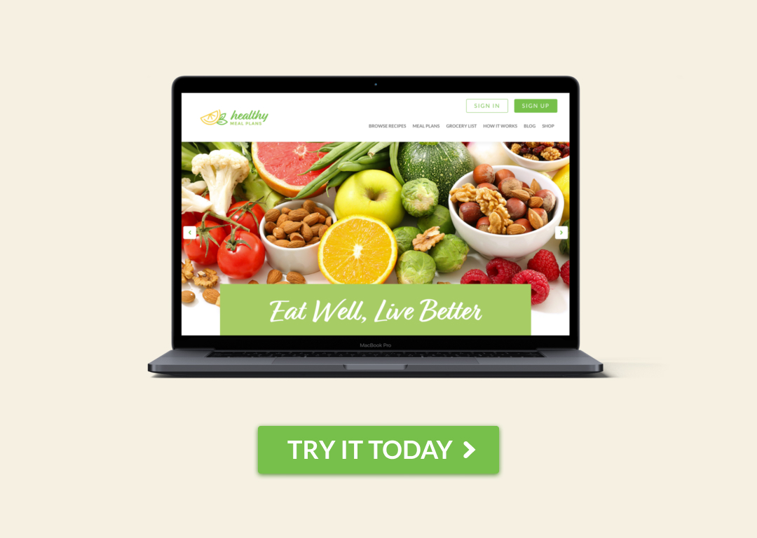
Healthy Meal Plans is a responsive web platform that helps people meal prep conveniently while maintaining a nutritious lifestyle based on dietary preferences.
My role
My initial role was to UX audit Healthy Meal Plans’ existing solutions and convert assets to the development team. However, my responsibilities evolved into full product design cycle due to constraints that would have delayed the launch date.
Challenge
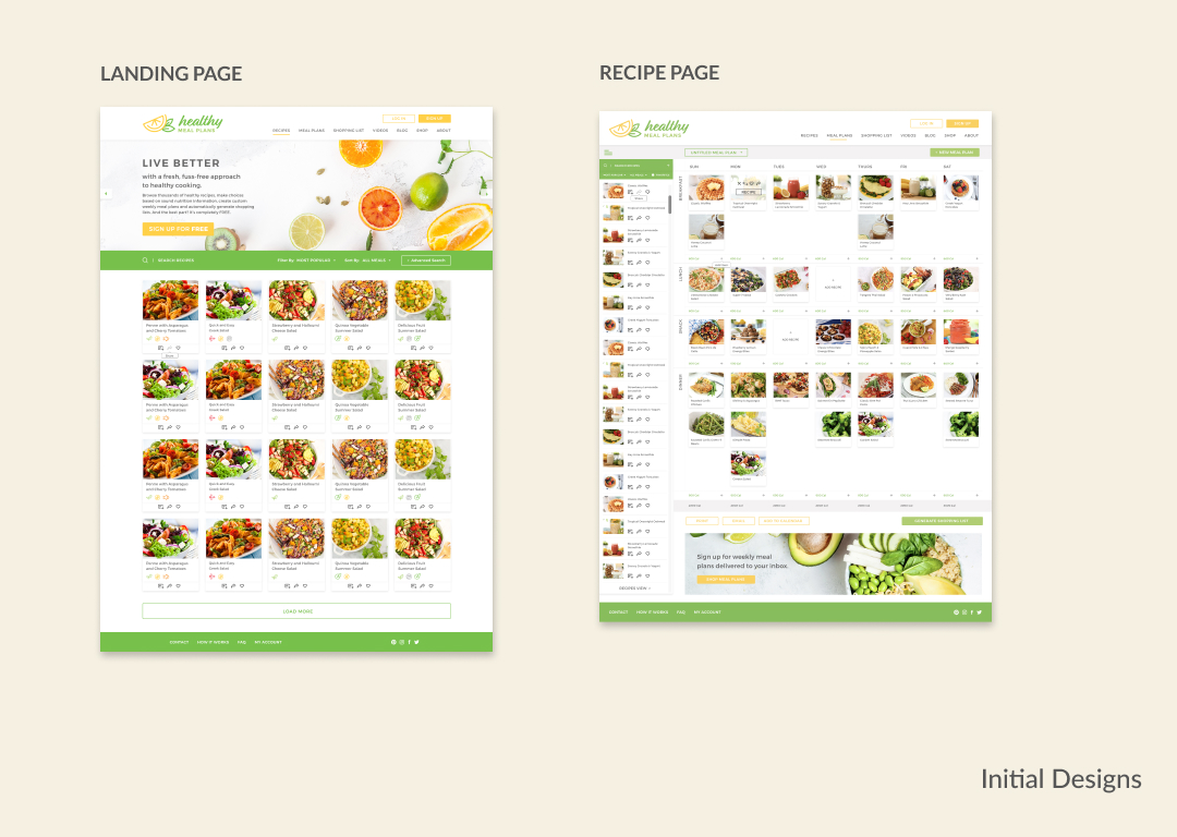
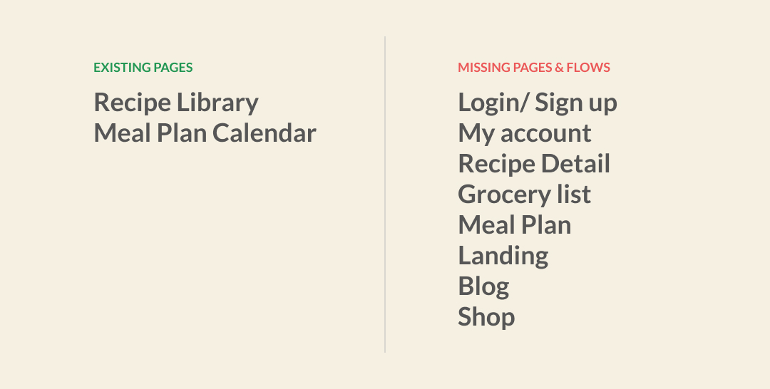
The existing concept had many missing parts and new design solutions were needed to fill in the gaps for mobile, tablet and desktop. Only the landing and meal plan pages were provided, so it was a challenge for our team to visualize the full picture. In addition, the master file was setup for print production, so it delayed asset hand-off process because design specs were needed. With a tight deadline looming for the 1st sprint, my priority was to assist client convert assets into a scalable format, which allows development team to start building the environment.
Process
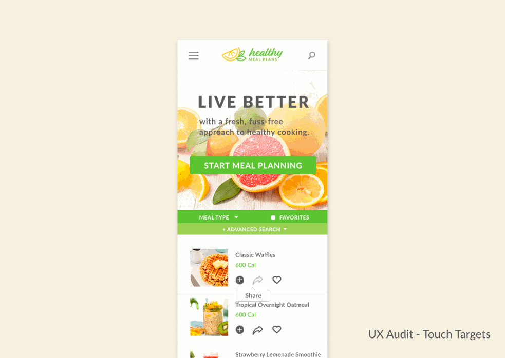
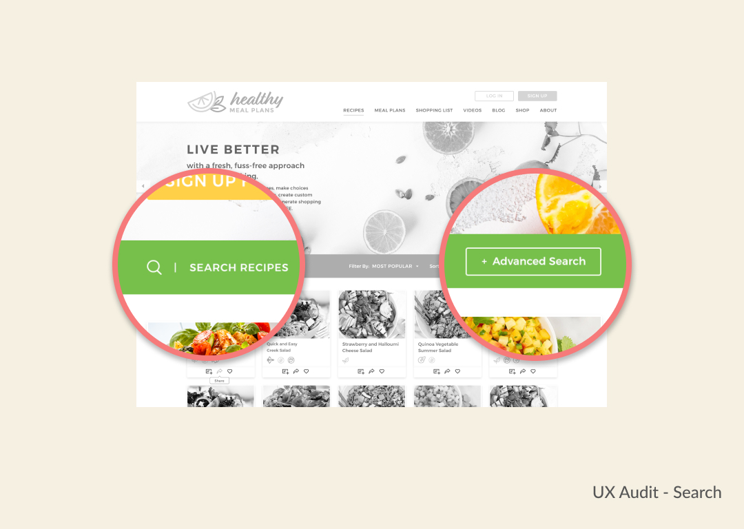
As I began the conversion from Photoshop to Sketch & InVision, I couldn’t help but notice many opportunities for improvements. I persuaded the clients that a heuristic evaluation is needed on their existing design, so they can launch a better product. Client agreed and we began a series of UX audits. I would recommend best practices so that the client’s internal team can iterate.
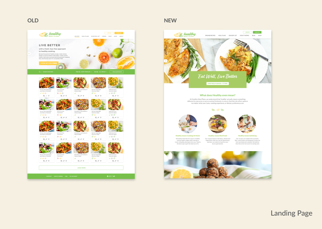
Client had a vision to put recipes and landing page on the same page but user interviews showed that they thought it was another recipe site and didn’t understand the value it brings to meal prepping. I raised concerns about this insight and client agreed to design a proper landing page separate from the recipe page.
We won the client's trust
Near the end of my UX audits, the client requested to extend my services and entrusted me to complete the product design cycle.
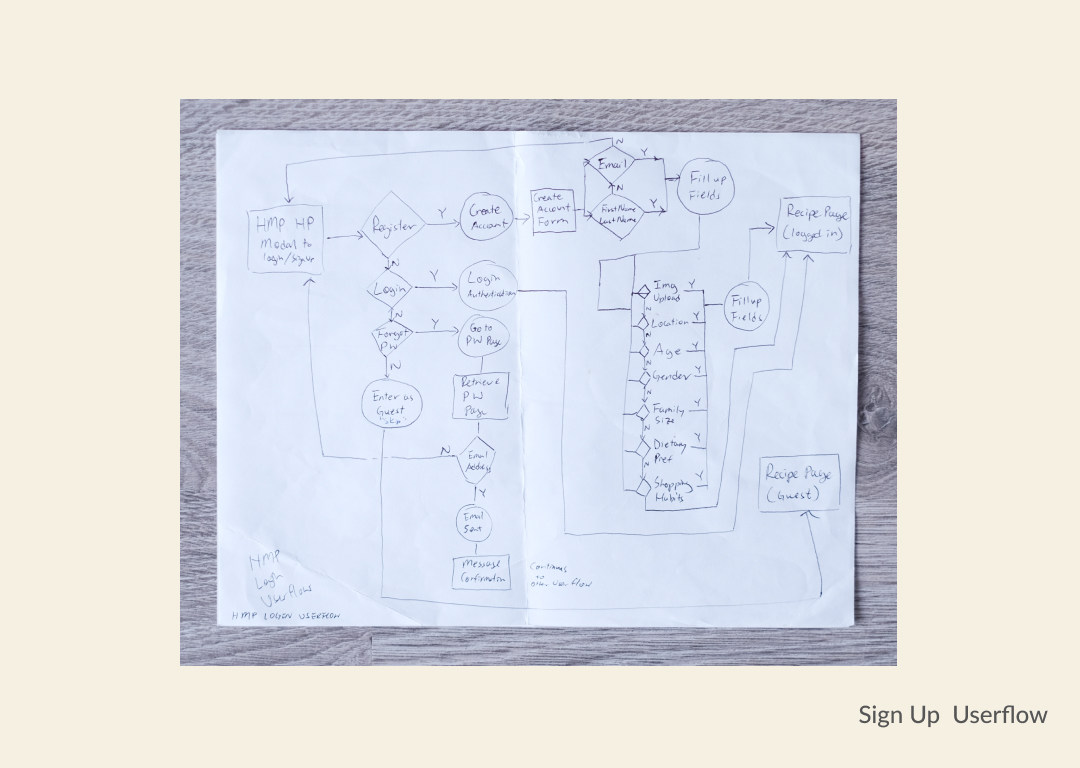
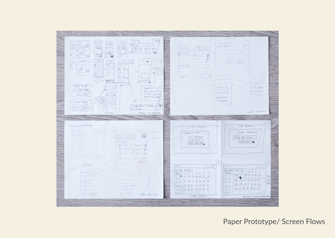
First priority was to conduct competitor analysis, business value proposition and user interviews before diving into any design solutions. After identifying key opportunities and common patterns, I sketched out the sitemap, and user flows to complete the missing parts of the product. I believe in producing paper prototypes because it’s the quickest way to identify any technical constraints with project lead and engineers.
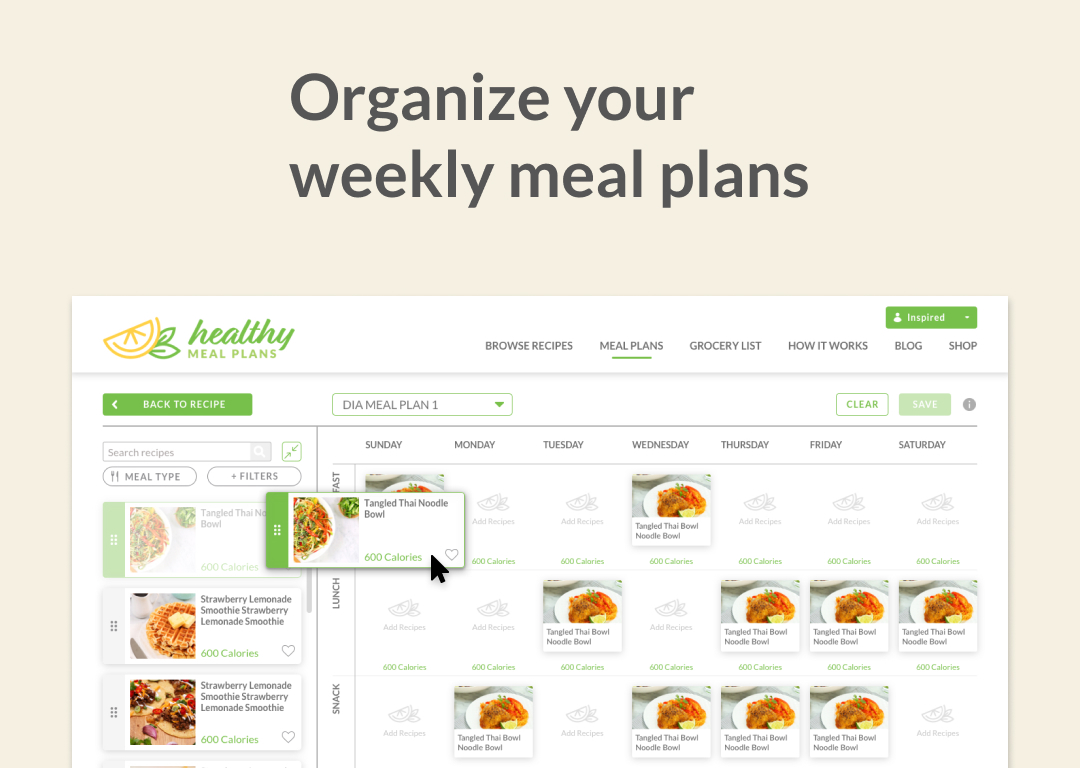
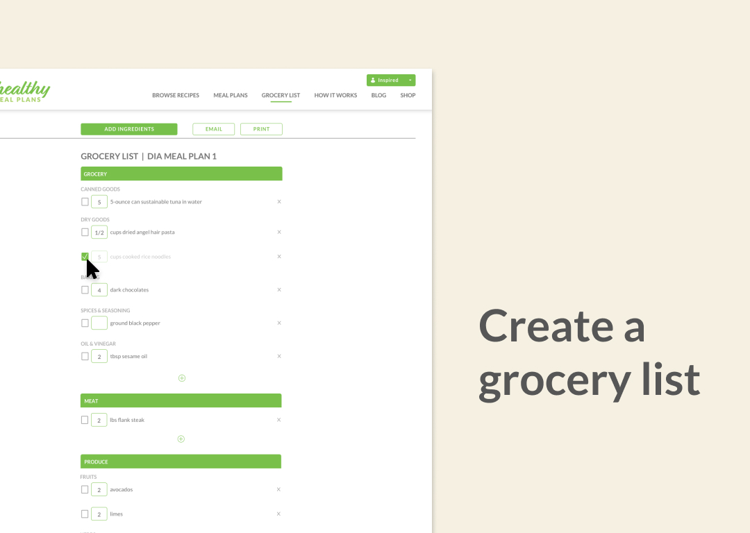
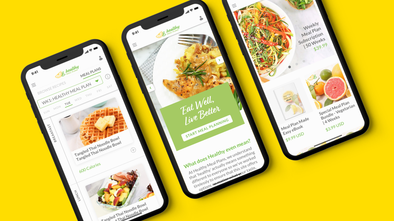
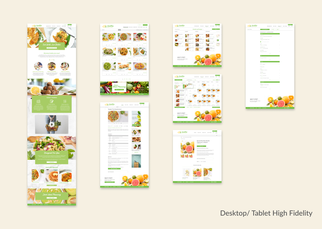
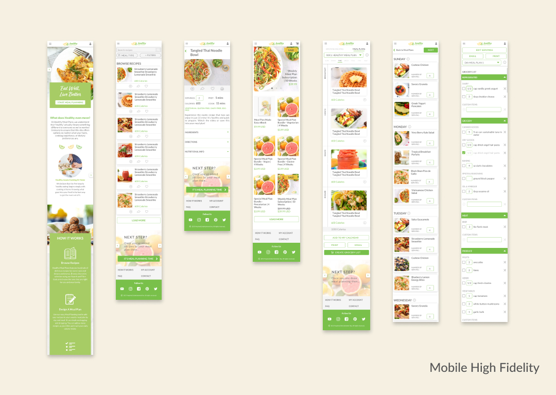
Second priority was the missing interaction screens between pages. For instance, what will the screen flow look like when a user creates a customized calendar and exports a grocery list? Most importantly, how will the desktop version scale down to tablet or mobile version yet retain a similar experience?
Near the end of my UX consultation, the client requested to extend my services and entrusted me to complete the product design cycle.
We worked in a 2 week sprint cycle for each page, where design approvals happen on the first week and development follows right after. I understood that certain parts of the product will require more time for the engineering team, so on high development effort weeks, I made sure to allocate more time for engineering team to develop while keeping our sprint goals on time.
Impact on users
After the launch, I gathered feedback from users to see which part of the product impacted them the most. Healthy-conscious users appreciated the availability of nutritional information on each recipe because they can now make informed choices when prepping their meals. In addition, the serving size adjustments that dynamically change the portion of each ingredient made it effortless when shopping with the grocery list.
Outcome
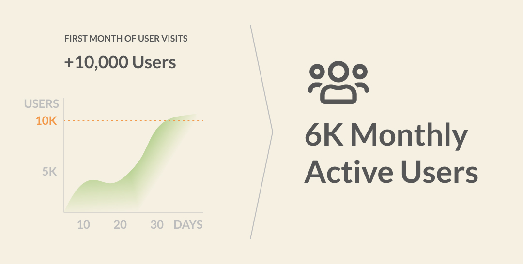
After 3 months of quick iterations and development, we completed all the missing parts without delay because we won the client's trust early on and gained full control on the product design cycle. On the first week of January, we successfully launched Healthy Meal Plans and attracted 10k+ visitors on the first month, 6K active monthly users and still growing.