Music Player
About the Project
This was a 2 hour UI challenge where I researched the music player market and made quick iterative solutions based on existing design patterns.
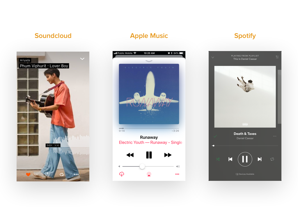
Market research
From research, I found Apple, Spotify and Soundcloud were amongst the most used music players. I collected screenshots and observed their unique UI placements and hierarchy that each product possess.
Insights
- Most have large song control buttons
- They emphasize song titles, artists and album covers
- Options to like, share, repeat, shuffle are visible as lower hierarchy
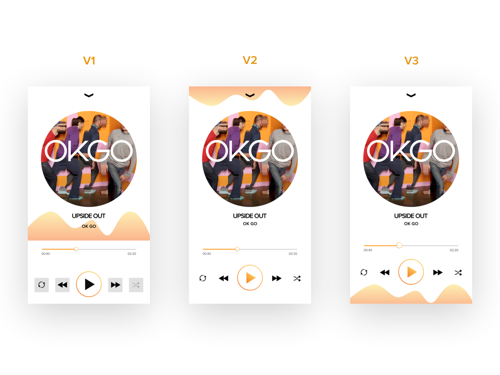
Design iterations 1
I wrote down my primary features that are needed and started with pencil sketches then moved onto Sketch.
From V1-V3, I wanted to convey a very simple yet interactive design by placing sound waves that moves while the song is playing. But when I showed this to my peers, they asked a very good question which made me drop the wave altogether.
Will users actually look at the screen for moving sound waves while listening to their favourite tunes?
Design iterations 2
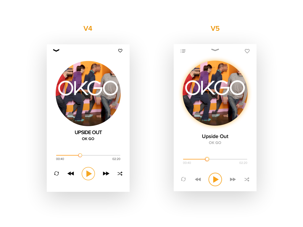
From V4-V5, I explored padding, text hierarchy and placed extra functions for music listeners to control. I added a hint of shadow that responds to overall album cover. The additional buttons at the top felt cluttered and I questioned my peers once again for feedback.
What does it mean to favourite or have extra options in a music player?
Final touches
I removed the extra option and favourite buttons from V5 because I'm assuming there is machine learning in the music player itself, so music enthusiasts can listen more of their favourite tunes.
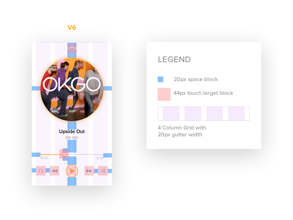
I applied the 20px spacing rule onto my design and made sure all graphics are neatly padded while being mindful of the 44px touch target sizes for all buttons.